One of the rare challenges I encountered while working with Vue.js which could not immediately be answered by Vue s impeccable documentation was our clients requirement of enabling the user to choose a theme for their profile.
This requirement in itself at first did not seem complicated, however, the client insisted on giving the users the opportunity to see their chosen theme reflected on their page as they choose a color, and also not limit them to a specific set of colors.
This is something we as a team grew to call “Live theming”.
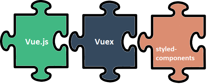
Being assigned the task of finding an elegant solution for this requirement led to the discovery of one of my favorite modules out there when it comes to building component based web apps: styled-components.
Styled-components turned out to be the missing piece we needed in our Vue and Vuex based solution.
I am going to share what I came up with to solve this problem through a practical example, with the hope that some of you might find it useful or interesting.
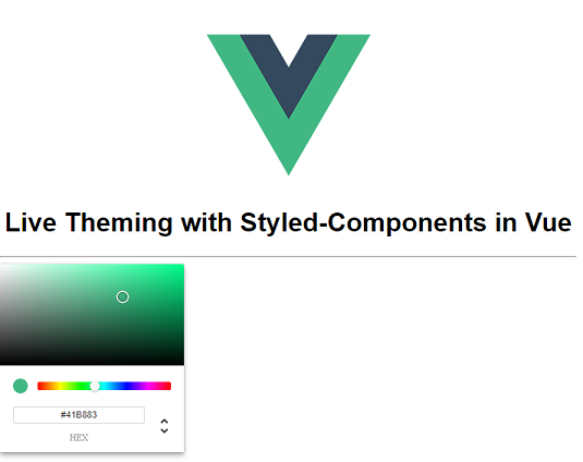
Let s dive right into it by taking a look at what we want to build:
Our ultimate goal here is to have a color picker component from which the user can choose a color. As the user tries out different colors we want those changes to be reflected on specific predefined components which are affected by the theme.
The main challenge here is not making this happen on screen, but rather implementing it in such a way that it is easy to use and maintain throughout the life cycle of the project.
We want to accomplish the following:
- Themed components must be easy to place and use anywhere in our code without additionally worrying about specifying repetitive styles or redundant code.
- We want to be able to use them as usual html tags, but theming should already be incorporated into them.
- We should be able to define more complex styles for those components, for example a style to be applied on hover.
- Using CSS frameworks like Bulma or Bootstrap on top of our styles for those components should not be a problem, as we want to be able to style them as the rest of our app. So if our buttons are Bulma buttons, then we want our themed button to also be a Bulma button but with our theme added to it.
The 6 steps we need to take to make this happen:
1. Create Project
The first thing we need to do is create a new Vue project. For the purpose of this demo I used this template which is a simple template including webpack and vue-loader suited for prototyping. Just follow the instructions for its usage and you are good to go.
2. Setup Vuex store
Having a global variable which holds the currently chosen theme color and is used by components all across our app is obviously a job Vuex can do marvelously. So let s take care of that next.
Install Vuex by running npm install vuex ÔÇö- save .
I like separating the store into a folder for holding all store modules. In this simple case we will only have one global store, but in a complete project this might be placed into a store module on its own.
For organizational purposes let s keep it that way. Add a folder called “store” in the “src” folder, and create a js file called “index.js”. Our state needs to hold the color of our theme, to which I assigned Vue s color as a default value. We will need one mutation which will set the value of that color based on the user s input on the color picker.
Finally, we need one getter to retrieve the value of that color and pass it to all our themed components. So the index.js file will look as follows:
We need to add this store to our App.vue component. In the src/main.js file import the declared store by adding import store from ./store ; at the beginning and add the store to the vue instance.
new Vue ({
 render: h => h(App),
 store,
}).$mount('#app') 3. Create ColorPicker component
The next thing we need is our color picker which will interact with the store to set the value of the color. For my demo I used the color picker we used on our project because of its beautiful design but feel free to use <input type="color">if you like.
First create a folder for our components inside the “src” folder, and create a .vue file for our color picker component called “ThemePicker.vue”.
The next thing we need to do is install the color picker component we decided to use by running npm install vue-color --save.
In the script tag of our ThemePicker component add import { Chrome } from vue-color ; to use the chrome looking color picker, and declare it as a component in the components list.
import { Chrome } from 'vue-color';
export default {
 components: {
  'chrome-color-picker': Chrome,
 },
};
If you are interested in more details about this vue component or want to use one of the other designs it offers take a look at its documentation.
We need to be able to hook this component up with our store, so we will import mapGetters and mapMutations from vuex in order to give our component access to the currently selected color and the ability to set that color to the color picked by our user.
We will finish up the component by using the chrome-color-picker component in our template together with the store. Our finished component looks as follows:
The color picker always shows the themeColor because its value is bound to the getter s value, while on every input that value in the store is updated through the mutation. All this ensures that the color picker and store are always in sync.
We can now use this component in our App.vue component after importing and adding it to its components list.
Which results in the following screen:
4. Create themed components
Now it is time to create the components that will receive this color as an input. My first instinct for implementing this behavior was to simply pass in the color from the store in the inline style for a component. This would work perfectly fine. However, it created several issues we wanted to avoid.
We wanted to avoid inline style as much as possible, as it is difficult to maintain later on, in comparison to keeping the CSS at a place dedicated for it, thus enhancing our separation of concerns.
The other issue with this approach was that it burdened future developers with having to think about this every time they needed to use a themed component, rather than hiding the implementation details and make them available only if you need to work on them explicitly.
The developers using these components in the future need to just be able to use them without worrying about the implementation details.
The last problem with the inline approach was the inability to add more complicated behaviors like hover styles for example.
Styled-components are the perfect solution to all these problems.
They allow us to separate CSS from the rest of our code and still enable the passing of props that make sure we can change the color of components after the page has already been loaded.
The first thing we need to do is install styled-components for vue by running npm install vue-styled-components --save.
Let s create a “styled-components” folder inside of the “components” folder to keep the components created as styled components separate from our plain vue components.
Inside this folder we can now start to add all the components we want to use throughout our application as themed components. Let s start with a themed button:
For the themed button I have only defined a background and text color, but you can literally use everything CSS offers inside the string literal that defines the style of this component.
This component is now ready to receive its color property from our store and change its color as the store updates.
5. Make components globally available
We could import this button now in any component which needs access to it, declare it in its components list and use it as follows:
<ThemedButton :color="$store.getters['themeColor']">Some Button</ThemedButton>However, this doesn t work completely with the idea of how we want to use our themed components, as we would need to import the component every time we want to use it and remember to add the color property pointing to our store each time. This is time consuming and tedious for a component as common as a button.
We want to make our button a global component, so we will wrap our styled component in another global component which we will actually use throughout our app. This global component will already use the store in its template so we don t need to worry about that each time we use the button.
Let s add an index.js file inside of our styled-components folder. This file will hold all of our styled global components, which we can then use after importing this file in main.js: import ./components/styled-components ;
We import Vue and our themed button and create a new component which uses our themed button exactly as we would have used it without the wrapper. Instead of us writing this code each time we want to use our button, we simply use the themed-btn as a component.
Now we can use it by just typing <themed-btn>Some Button</themed-btn>.
6. Use components
One last thing I want to do before using my components is add Bulma to organize our components in a better way on screen, and demonstrate how our solution with global components enables us to add Bulma on top of our styling and have our themed button always be styled as a Bulma button.
So let s first install Bulma by running npm install bulma --save, and importing it (import bulma/css/bulma.css ;) in our App.vue component.
Now we can simply add class = “button” to our ThemedButton in its template in our index.js file. This will make sure that our button always looks the same, without having to add the button class each time we use our themed button.
export const themedButton = Vue.component('themed-btn', {
 components: { ThemedButton },
 template: `<ThemedButton class="button"    :color="$store.getters['themeColor']"><slot></slot></ThemedButton>`,
});
I added some bulma classes in our App.vue component to organize the components into columns, and I created two other styled components called ThemedTitle and ThemedFooter.
The complete code of this example can be found here.
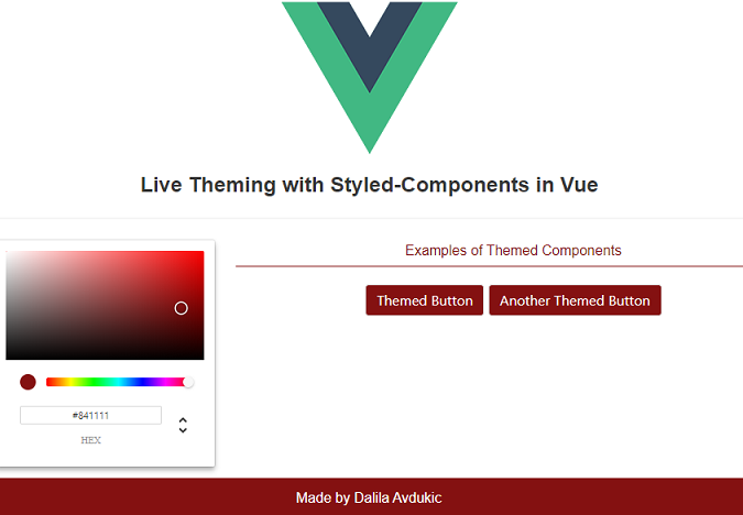
And this is how our finished project looks like:

Now if we move our mouse through the color picker all themed components will change color giving our user the opportunity to try out different colors before deciding which one to use.
This implementation can be used to store a desired color in the database, and then later retrieve it as the default color for the signed in user.
I hope you enjoyed this little demo.
It is not a very common request to have this kind of a feature, but I found it extremely enjoyable to work on, mostly thanks to Vue s simplicity and the simple brilliance of styled-components.
If you have any questions or suggestions feel free to contact me at dalilaav@maestralsolutions.com.